uciAPC
An artificial pancreas controller for use in a closed-loop insulin delivery system.
Data Visualization
by Mike
The simulator gives us a lot of data.
For a 36 hour simulation with 3 min CGM interval, 720 data points are generated for each category: blood glucose, CGM value, hbgi, lbgi, etc. 10 patients (of each category, adults, children, adolescents) are run during each single run of the simulation. To get a reliable estimate of control performance given sensor noise, multiple runs of the simulation are required. 100 runs of the simulation across 10 patients generates 7000 x 720 data points – over 5,000,000 data points 1
To make sense of this data, it must be visualized.
An obvious choice for visualization of blood glucose is simple time series data. That is, how does blood sugar vary over time? In the best case? In the worst case? In the average case? It’s very common in the literature to generate a time series plot that shows the blood sugar over time, the insulin delivered over time, and meals. Nearly every AP paper has a chart that shows this. For example:
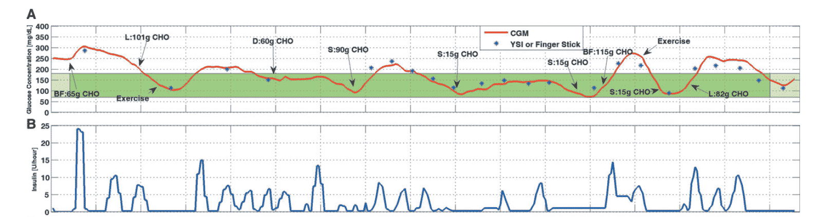
Source: Multivariable Adaptive Closed-Loop Control of an Artificial Pancreas Without Meal and Activity Announcement, Turksoy et al.
This is an obvious first step for visualization. Our version is shown below:
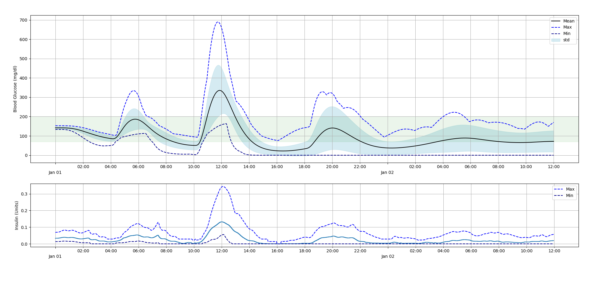
This gives us a nice qualitative indication of what is happening to the blood glucose over time, as well as how the controller responds to changes in blood glucose.
What if we want to compare different controllers against one another?
The timeseries plot doesn’t make it too easy to compare two separate controllers. There are many, many ways to visualize this data.
Numerical measures:
Some numerical measures of performance spring easily to mind, and are easy to find:
- Mean, Std of glucose
- Mean glucose in post-meal window
- Maximum, Minimum glucose in post-meal window
- % Time in target range
- Number of readings in bins, e.g:
- >50 (severe low)
- 50-70 (standard low)
- 70-140 (in range)
- 140-210 (slightly high)
- etc.
- Number of low events
- Number of pump suspensions
- LBGI and HBGI… fortunately these two are generated by the simulator
- Mean/std. of BG rate of change
Poincare Plots
A useful tool for analyzing stability of complex systems is the Poincare plot. A Poincare plot (for time-series data) is a mapping between the value of a point at one point in time xk and the next point in time xk+1. The value of xk is placed on the x-axis and the value of xk+1 is placed on the y-axis. If the data is highly variable, these points will swing widely through the chart; if the data is not variable at all, they will be concentrated in a small area. Such plots are used frequently to evaluate the variability of biological rythms (and stable, periodic systems in general) and they will prove valuable to us.2
Below is an example:
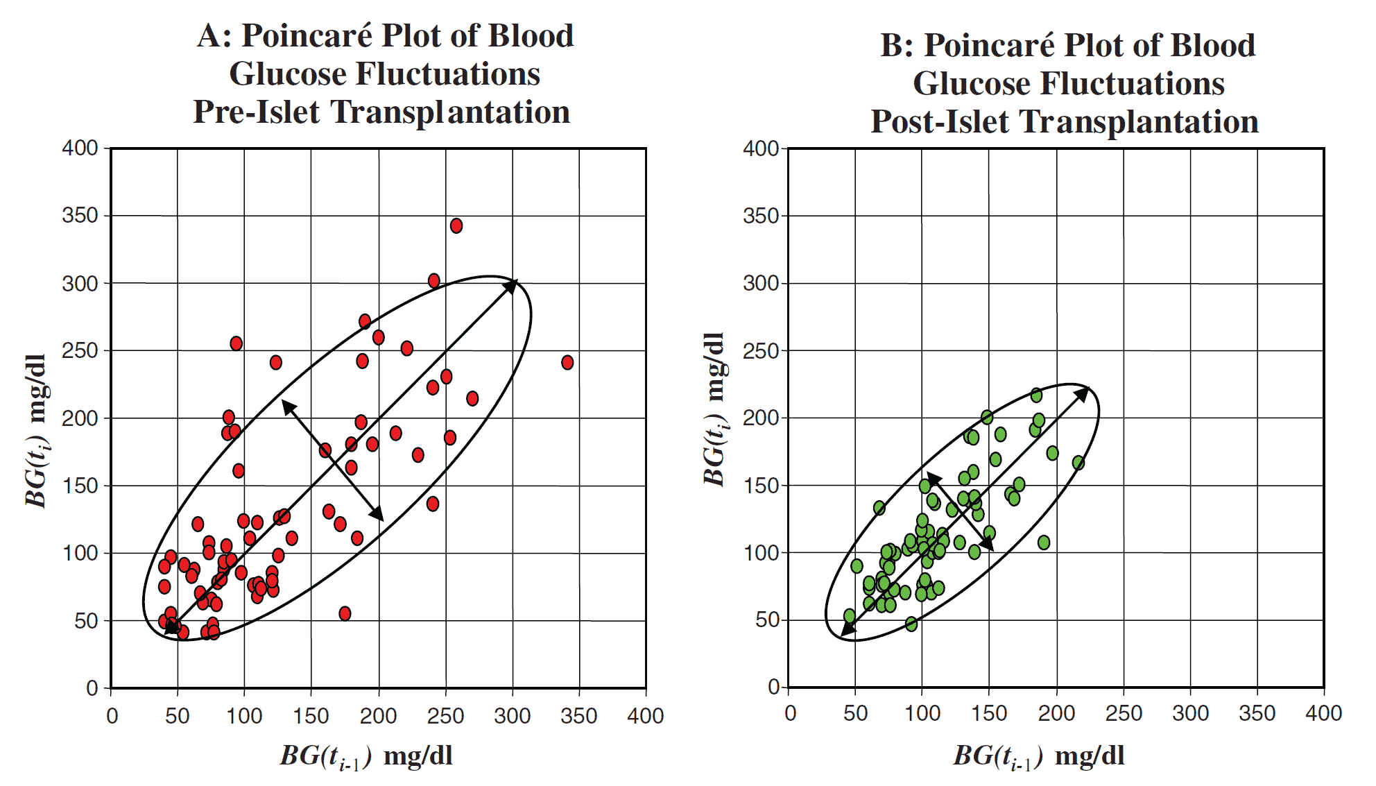 Source: Statistical Tools to Analyze Continuous Glucose Monitor Data,
William Clarke, M.D. and Boris Kovatchev, Ph.D., 2008
Source: Statistical Tools to Analyze Continuous Glucose Monitor Data,
William Clarke, M.D. and Boris Kovatchev, Ph.D., 2008
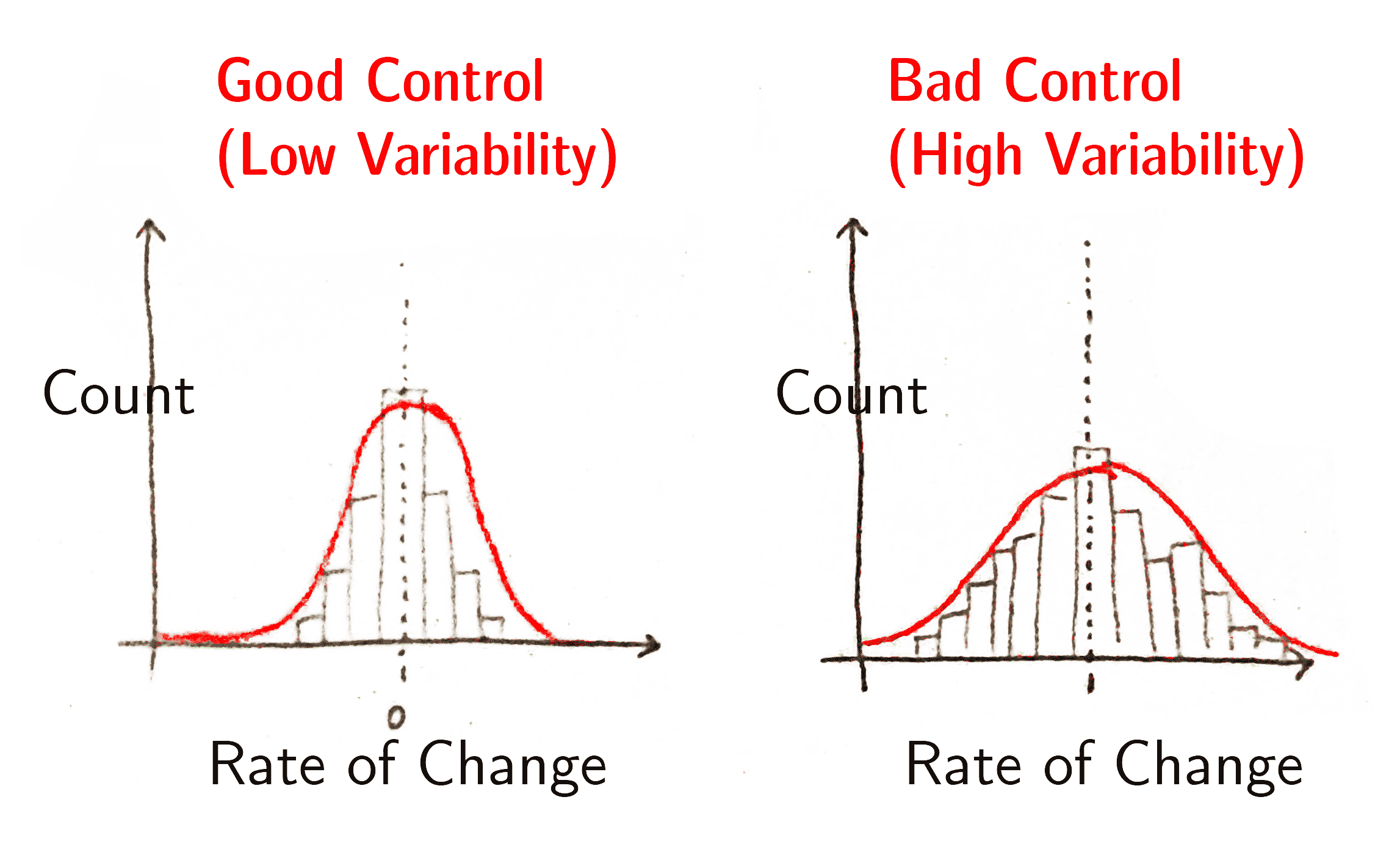
Rate of Change Histogram
The variability of blood glucose is important. A perfect controller would keep the blood sugar exactly stable at a constant, target value – the derivative, therefore, would be exactly zero across the entire time series. By contrast, a highly variable blood glucose would have a much wider distribution of derivatives. A histogram of these derivatives (BGk - BGk-1)/dt would quickly and easily visualize the distribution:
[1] It takes approximately 3.5 hours to do such a run on my machine without multiprocessing support. Currently, fixing multiprocessing is a focus, as that will enable a tighter design loop.
[2] Strogatz SH. Nonlinear Dynamics and Chaos: With Applications to Physics, Biology, Chemistry and Engineering. Washington, DC: Perseus Books Group, 2001
tags: visualiation - progress report